library(tidyverse)
library(dplyr) #data functions
library(readr) #for reading csv files
library(DT) #to make nice data tables

# Table packages not specifically used here
#library(knitr) #most useful for tables and knitr function
#library(kableExtra) # used to make responsive tables

## Visualization
library(ggplot2)
library(mapview)
library(maps) # for city names
library(sf) # to convert data.frame to spatial objects

## Interactive viz
library(plotly)
library(leaflet)

## Census
library(tigris) Plotting Pb Data and Census Tracts in R
Introduction
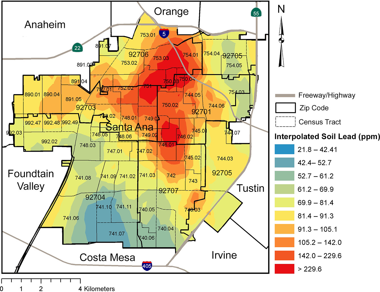
This is a Quarto document to show processing Masri et al. (2020) supplementary data in R, in order to reproduce, to my best ability, the Pb concentration heat map plots. I am unable to replicate the data because I do not have the resources to collect thousands of natural samples and run Pb concentrations on them! However, I am also limited in my ability to reproduce the plots, because I do not have the model for data interpolation.
Their method is quoted as follows:
Pb concentrations were mapped and spatial interpolation was conducted to generate a continuous smoothed map of soil Pb concentrations across the city.
The interpolated soil lead figure (Figure 4) from Masri et al. (2020) is visually striking and effective in its impact. This walk-through is an attempt to answer the question, “What is the limit of data reproduction in interpolated models?”, from the perspective of someone who supports the open science movement, while acknowledging the sensitivity needed for community engagement and community science.
The nuances of reproduction vs. replication are significant when presenting high-resolution spatial data. Full data transparency aligned with the open science movement could pose dilemmas about resident anonymity.
“Despite efforts to coalesce around the use of these terms [reproduction and replication], lack of consensus persists across disciplines. The resulting confusion is an obstacle in moving forward to improve reproducibility and replicability” (Barba et al., 2018; NASM, 2019)
Load Packages
I did not use all of these packages, but I tend to load these for most of my data processing:
Load Data
Tigris Census Tracts Data
Experimenting with Tigris package. Tigris simplifies the process for R users of obtaining and using Census geographic datasets.
The states() function can be run without arguments to download a boundary file of US states and state equivalents. Tigris typically defaults to the most recent year for which a complete set of Census shapefiles are available. I believe this one is 2022, as one of the return messages is “Retrieving data for the year 2022”.
We are also gathering Orange County, CA tracts by using the tracts() function.
We are also getting data to plot roads with the maps package by using the primary_secondary_roads() function from the maps package. This code chunk is commented so that the huge progress bar doesn’t get printed, but it does exist!
# Getting all states data
# st <- states()

# Getting California county data
# ca_counties <- counties("CA", cb = TRUE)

# Getting Orange County census tracts
# OC_tracts <- tracts("CA", "Orange")

# Getting roads data (lines)
# CA_roads <- primary_secondary_roads("CA") |> filter(RTTYP %in% c('U','S','I'))
City Names Data
This is to get city names in California, again with the maps package. This is performed in two steps.
## Data on 1,005 US cities
data(us.cities)
Once the city data is loaded (check global environment to make sure there are rows), save specific city names from California, and remove redundant information.
cities_data <- us.cities |>
  filter(country.etc %in% "CA") |>
# This will drop the state name from the name column
  mutate(fixed_name = str_replace(name,country.etc,''))
Masri et al. (2020) Data
I am importing in the Appendix from Masri et al. (2020) which is a Word document containing tables: https://ars.els-cdn.com/content/image/1-s2.0-S0048969720342881-mmc1.docx
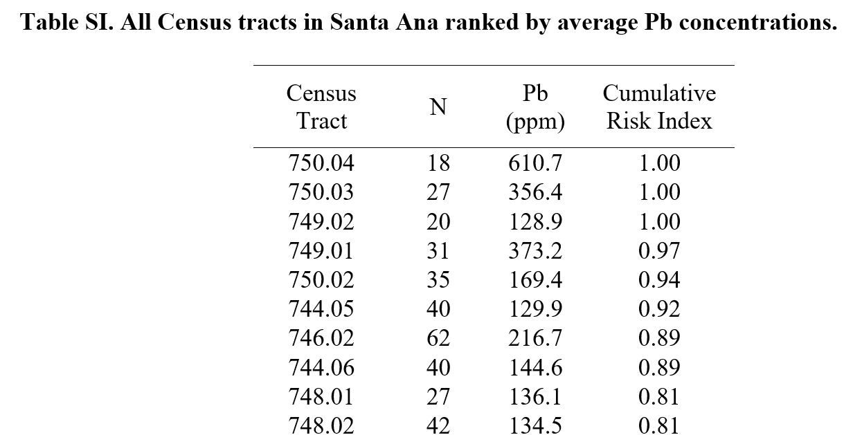
Here are the first 10 rows of Table SI.
This is pretty tidy data that I do not need to transform into proper variables/values/etc. However, I renamed some columns to be more descriptive. I did this in Excel because it is simply easier to do this in a WYSIWYG editor, even though it is fairly easy to change column names in R!
- Census Tract to
census_tract_number - N to
n_number - Pb (ppm) to
pb_ppm_average
I imported the csv files in to R:
masri_table_SI_raw <- read_csv("table_SI.csv",
                               col_names = TRUE)

masri_table_SII_raw <- read_csv("table_SII.csv",
col_names = TRUE)table_SI.csvis table 1. We store the raw data asmasri_table_SI_raw. We are using this for the rest of this document!table_SII.csvis table 2. We store the raw data asmasri_table_SII_raw. I am not processing this today, but FYI, it contains zip code average data, which appears to be an average of census tract data…
We are working with the first table today. It has 61 rows and 4 columns: census tract, number of samples analyzed, Pb (ppm) averaged, and cumulative risk index. Each row has data for each census tract. See below:
print(masri_table_SI_raw)# A tibble: 61 × 4
census_tract_number n_number pb_ppm_average cumulative_risk_index
<dbl> <dbl> <dbl> <dbl>
1 750. 18 611. 1
2 750. 27 356. 1
3 749. 20 129. 1
4 749. 31 373. 0.97
5 750. 35 169. 0.94
6 744. 40 130. 0.92
7 746. 62 217. 0.89
8 744. 40 145. 0.89
9 748. 27 136. 0.81
10 748. 42 134. 0.81
# ℹ 51 more rowsNow, the next code chunk is processing this raw data masri_table_SI_raw into a processed data tibble named masri_census_lead. The changes I am making are adding (mutating) additional columns:
- Census tract ID, or
census_IDto make a primary key (number for each observation), from 1 to 61. Note that the order is straight from the supplementary data and I am unsure of the logic of the original sorting. - Adding a categorical level, from 1-10, called
pb_ppm_average_level, which will match the color scheme of the original Masri et al. (2020) figure. E.g., 1 is the lowest level (values less than 42.4 ppm) and 10 is the highest (values above 229.6 ppm). - Census tract number
NAMEthat matches the Tigris census tract column. This is stored as character instead of number to also match the Tigris data.
masri_census_lead <- masri_table_SI_raw |>
  mutate(census_ID = row_number(),
         pb_ppm_average_level = case_when(
           pb_ppm_average >= 21.8 & pb_ppm_average < 42.4 ~ '1',
           pb_ppm_average >= 42.4 & pb_ppm_average < 52.7 ~ '2',
           pb_ppm_average >= 52.7 & pb_ppm_average < 61.2 ~ '3',
           pb_ppm_average >= 61.2 & pb_ppm_average < 69.9 ~ '4',
           pb_ppm_average >= 69.9 & pb_ppm_average < 81.4 ~ '5',
           pb_ppm_average >= 81.4 & pb_ppm_average < 91.3 ~ '6',
           pb_ppm_average >= 91.3 & pb_ppm_average < 105.2 ~ '7',
           pb_ppm_average >= 105.2 & pb_ppm_average < 142.0 ~ '8',
           pb_ppm_average >= 142.0 & pb_ppm_average < 229.6 ~ '9',
           pb_ppm_average >= 229.6 ~ '10',
           TRUE ~ 'NA'
           ),
         NAME = as.character(census_tract_number)
         )
Finally, for some reason, one census tract just kept getting stored as just “741.1” instead of “741.10” because of some rounding issue, which ends up messing the join later. So, I have to add a “0” at the end to this one value (which is the last one, or number 61):
masri_census_lead$NAME[61] <- "741.10" Perform data join
To be able to plot the Masri et al. (2020) data with census tracts, I am performing a left join. A left join is visualized in the figure below:
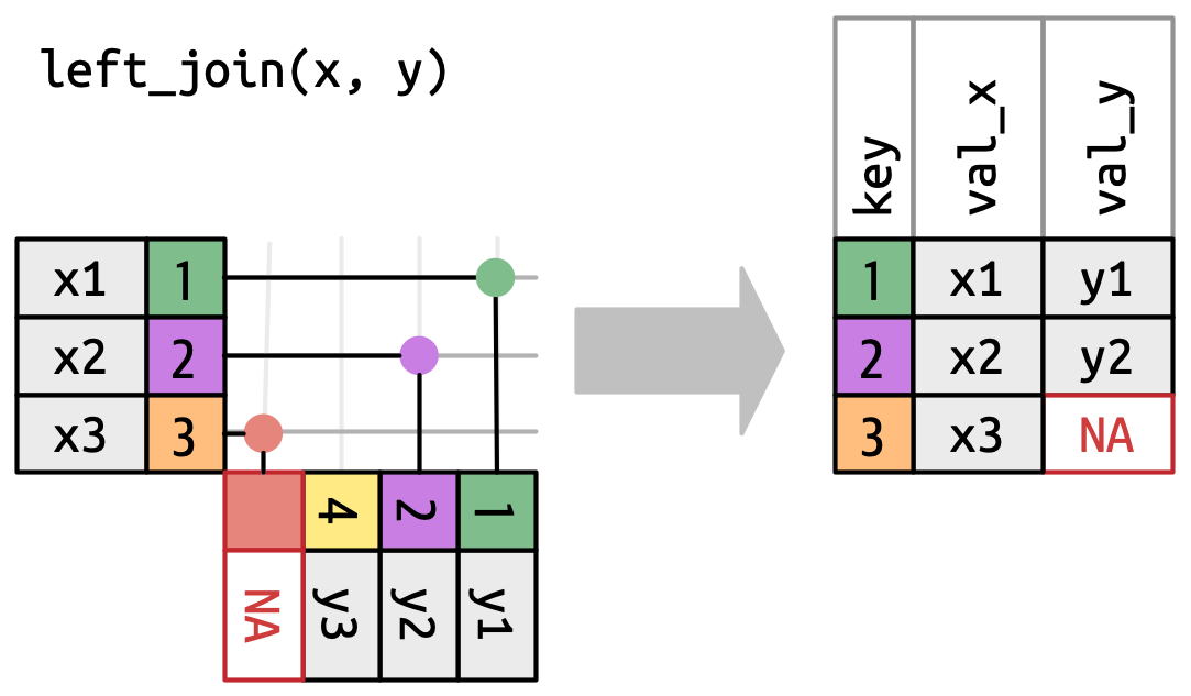
In my case, the left table (x) is the Masri et al. (2020) data and the right (y) is the California census data. This means I only keep matches from the census data, and drop any unmatched columns (basically, anything that isn’t in the Orange County area of focus).
masri_census_join <- masri_census_lead |>
# Left Join with OC_tracts
  left_join(OC_tracts, by = "NAME") |>
# Re-order columns so that census_ID is first
  select(c(census_ID, everything()))
Print out the column names of the joined data, and we see that there are far more than the original 7 columns. All of the column names in all capital letters are from the census data. The final column, geometry, has the polygons or shape data to be able to map the census tracts.
colnames(masri_census_join) [1] "census_ID" "census_tract_number" "n_number"
[4] "pb_ppm_average" "cumulative_risk_index" "pb_ppm_average_level"
[7] "NAME" "STATEFP" "COUNTYFP"
[10] "TRACTCE" "GEOID" "NAMELSAD"
[13] "MTFCC" "FUNCSTAT" "ALAND"
[16] "AWATER" "INTPTLAT" "INTPTLON"
[19] "geometry" Note that city names do not have to be joined here, they can be called upon when making each plot.
Save new .csv file with the joined data
Save this new .csv file into a folder where I store the R outputs.
#write.csv(masri_census_join, "data-outputs/masri_census_join.csv", na = "")Make database table for fun
Explore the data here instead of opening up the .csv file, if you would like.
I like to use function datatable() from the DT package to create an HTML widget to display R data objects. You could also use the kable and kableExtra packages to make database tables. The kable package is great for automating LaTeX tables as outputs!
datatable(masri_census_join,
# Do not show row names, it would be 1-61 and i already have census_ID
          rownames = FALSE)
Make Plots
First, I am going to get the bounding box information to get the limits/coordinates for any plots i make (xmin, ymin, xmax, ymax), where x values are longitude and y values are latitude. According to some tutorials, I should be able to use the st_bbox function to get these values, but I cannot find it! :(
masri_census_join$geometryGeometry set for 61 features (with 1 geometry empty)
Geometry type: MULTIPOLYGON
Dimension: XY
Bounding box: xmin: -117.9549 ymin: 33.69178 xmax: -117.8074 ymax: 33.78819
Geodetic CRS: NAD83
First 5 geometries:MULTIPOLYGON (((-117.8676 33.75431, -117.8676 3...MULTIPOLYGON (((-117.8764 33.75474, -117.8764 3...MULTIPOLYGON (((-117.8851 33.73995, -117.885 33...MULTIPOLYGON (((-117.8851 33.74794, -117.885 33...MULTIPOLYGON (((-117.8765 33.74796, -117.8765 3...After running this, I get this result (copied and pasted the bounding box result row).
xmin: -117.9549 ymin: 33.69178 xmax: -117.8074 ymax: 33.78819I will store these to make plotting easier:
xmin <- -117.9549
xmax <- -117.8074
ymin <- 33.69178
ymax <-  33.78819
For each plot, a lot of this information seems redundant and makes for long code chunks, but not going to try to store the info in a single chunk to recall because I’m not sure if that’s possible for ggplot (or, it would require some knowledge about order and sequence that is easy to forget).
Pb average (ppm) concentrations with original Masri color scale
First, I am going to make the color scheme for the target plot that I would like to reproduce. The color scale from Masri et al. (2020) figure is described in this color scale (breaks, labels, names).
# To match the factor levels in the data that i made
masri_pb_breaks <- c("1", "2", "3", "4", "5", "6", "7", "8", "9", "10")

# For color fill of census tracts
masri_pb_colors <- c("1" = "#4993CC",
                     "2" = "#73A7B5",
                     "3" = "#9ABDA1",
                     "4" = "#BFD389",
                     "5" = "#E3ED6E",
                     "6" = "#F7E74C",
                     "7" = "#F5AC46",
                     "8" = "#F18133",
                     "9" = "#D55C23",
                     "10" = "#DB0018"
                     )

# The interpolated Pb levels from Masri et al. (2020)
masri_pb_labels <- c("21.8-42.4",
                     "42.4-52.7",
                     "52.7-61.2",
                     "61.2-69.9",
                     "69.9-81.4",
                     "81.4-91.3",
                     "91.3-105.1",
                     "105.2-142.0",
                     "142.0-229.6",
                     ">229.6")
Now, I make the plot!
gg_masri_pb_average_original_colors <-

# Base join data
  ggplot(masri_census_join) +

# Census tract borders with grey borders
# Fill color Pb average concentrations
  geom_sf(color = "grey",
          aes(geometry = geometry, fill = pb_ppm_average_level)) +

# Add roads in blue
  geom_sf(data = CA_roads, color = 'blue', aes(geometry = geometry)) +

# City Names
  geom_text(color = 'black', data = cities_data, check_overlap = TRUE, size = 3.5,
            aes(x = long, y = lat, label = fixed_name)) +

# Census Tract Names
  geom_sf_text(size = 1.5,
               aes(geometry = geometry, label = NAME)) +

# Minimal theme gets rid of x and y-axis labels and grid
  theme_void() +

# White background so it is not transparent
  theme(panel.background = element_rect(fill = 'white', color = NA)) +

# Coordinate limits plus more x-axis to make room for the legend
    coord_sf(xlim = c(xmin, xmax+0.04), ylim = c(ymin, ymax)) +

# Label legend
  labs(fill = 'Pb (ppm) \naverage') + #label legend

# Custom color palette, legend labels
  scale_fill_manual(breaks = masri_pb_breaks,
                    values = masri_pb_colors,
                    labels = masri_pb_labels) +

# Move legend to bottom right
  theme(legend.justification = c(0,0), legend.position = c(0.80,0.05),
        legend.background = element_rect(fill = "white"),
        legend.margin = margin(1, 1, 1, 1, "pt"),
        legend.text = element_text(size = rel(0.75)))
Here, I have reproduced the color scale from Masri et al. (2020).
# Print plot to preview
gg_masri_pb_average_original_colors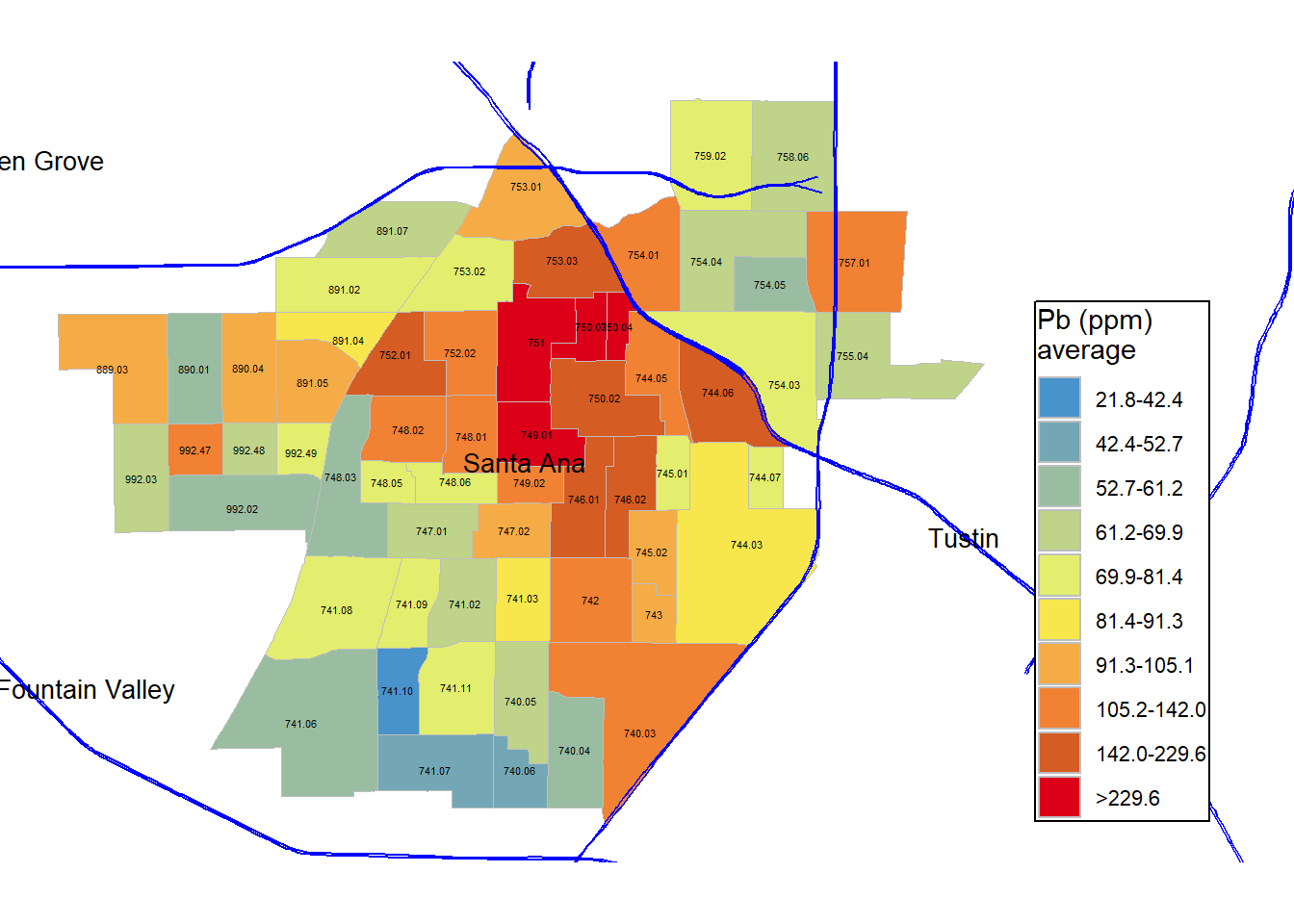
# Save plot (commented until I make changes to save)
#ggsave('figures/gg_masri_pb_average_original_colors.png', dpi=400, units='in')
Compare this to the original figure. What the differences and similarities?
Pb average (ppm) concentrations
gg_masri_pb_average <-

# Base join data
  ggplot(masri_census_join) +

# Census tract borders with grey borders
# Fill color Pb average concentrations
  geom_sf(color = "grey",
          aes(geometry = geometry, fill = pb_ppm_average)) +

# Custom gradient palette
  scale_fill_gradient(low = 'white',
                      high = '#DB0018',
                      na.value = 'white' )  + # custom fill palette

# Add roads in blue
  geom_sf(data = CA_roads, color = 'blue',
          aes(geometry = geometry)) +

# City Names
  geom_text(color = 'black', data = cities_data, check_overlap = TRUE, size = 3.5,
            aes(x = long, y = lat, label = fixed_name)) +

# Census Tract Names
  geom_sf_text(size = 1.5,
               aes(geometry = geometry, label = NAME)) +

# Minimal theme gets rid of x and y-axis labels and grid
  theme_void() +

# White background so it is not transparent
  theme(panel.background = element_rect(fill = 'white', color = NA)) +

# Coordinate limits, defined earlier with bounding box
  coord_sf(xlim = c(xmin, xmax+0.04), ylim = c(ymin, ymax)) +

# Label legend
  labs(fill = 'Pb (ppm) \naverage') +

# Move legend to bottom right
  theme(legend.justification = c(0,0),
        legend.position = c(0.80,0.01),
        legend.background = element_rect(fill = "white"),
        legend.margin = margin(1, 1, 1, 1, "pt"),
        legend.text = element_text(size = rel(0.75)))
Finally, I am interested in plotting out Pb concentrations with a simple gradient scale, instead of the color legend from the original paper.
# Print plot to preview
gg_masri_pb_average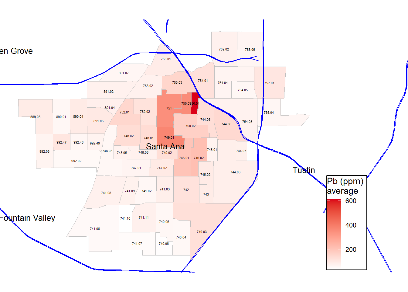
# Save plot (commented until I make changes to save)
#ggsave('figures/gg_masri_pb_average.png', dpi=400, units='in')
How does this differ from the original figure? In what ways is it the same? Food for thought…
Note that Masri et al. (2020) uses the 80 ppm California EPA recommendation to assess which areas are in excess and should be counted as high risk in a composite vulnerability index.
Number of samples collected per census tract
# Save with unique name
gg_masri_number_samples <-

# Base join data in ggplot
  ggplot(data = masri_census_join) +

# Census tract borders with grey borders
# Fill color depending on number of samples collected
  geom_sf(color = "grey",
          aes(geometry = geometry, fill = n_number)) +

# Custom gradient palette
  scale_fill_gradient(low = '#ffff99',
                      high = 'forestgreen',
                      na.value = 'white' )+
# Add roads in blue
  geom_sf(data = CA_roads, color = 'blue',
          aes(geometry = geometry)) +

# City Names
  geom_text(color = 'black',
            data = cities_data, check_overlap = TRUE, size = 3.5,
            aes(x = long, y = lat, label = fixed_name)) +

# Census Tract Names
  geom_sf_text(size = 1.5,
               aes(geometry = geometry, label = NAME)) +

# Minimal theme gets rid of x and y-axis labels and grid
  theme_void() +

# White background so it is not transparent
  theme(panel.background = element_rect(fill = 'white', color = NA)) +

# Coordinate limits, defined earlier with bounding box
  coord_sf(xlim = c(xmin, xmax+0.04), ylim = c(ymin, ymax)) +

# Label legend
  labs(fill = 'Number of \nsamples') +

# Move legend to bottom right
  theme(legend.justification = c(0,0),
        legend.position = c(0.8,0.01),
        legend.background = element_rect(fill = "white"),
        legend.margin = margin(1, 1, 1, 1, "pt"),
        legend.text = element_text(size = rel(0.75)))
Now, we are making different maps to visualize the supplementary data. Here, I am exploring the number of samples collected, and instead of using Pb concentrations as the fill, I just use the number of samples as the fill. The gradient is defined by two colors: light yellow for low, and forest green for high.
# Print plot to preview
gg_masri_number_samples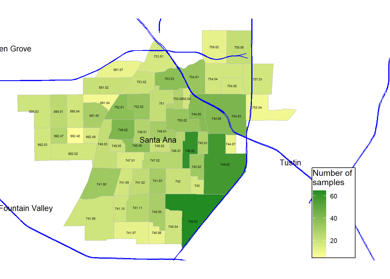
# Save plot (commented until I make changes to save)
#ggsave('figures/gg_masri_number_samples.png', dpi=400, units='in')
Sample density: Number of samples collected per square meter per census tract
gg_masri_number_samples_per_m_sq <-

# Base join data
  ggplot(masri_census_join) +

# Census tract borders with grey borders
# Fill color for number of samples divided by land area in square meters
  geom_sf(color = "grey",
          aes(geometry = geometry, fill = n_number/ALAND)) + #census tract borders

# Custom gradient palette
  scale_fill_gradient(low = '#ffff99',
                      high = 'sienna',
                      na.value = 'white' )  + # custom fill palette

# Add roads in blue
  geom_sf(data = CA_roads, color = 'blue',
          aes(geometry = geometry)) +

# City Names
  geom_text(color = 'black', data = cities_data, check_overlap = TRUE, size = 3.5,
            aes(x = long, y = lat, label = fixed_name)) +

# Census Tract Names
  geom_sf_text(size = 1.5,
               aes(geometry = geometry, label = NAME)) +

# Minimal theme gets rid of x and y-axis labels and grid
  theme_void() +

# White background so it is not transparent
  theme(panel.background = element_rect(fill = 'white', color = NA)) +

# Coordinate limits, defined earlier with bounding box
  coord_sf(xlim = c(xmin, xmax+0.04), ylim = c(ymin, ymax)) +

# Label legend
  labs(fill = '# samples \ncollected  \nper square \nmeter') +

# Move legend to bottom right
  theme(legend.justification = c(0,0),
        legend.position = c(0.78,0.01),
        legend.background = element_rect(fill = "white"),
        legend.margin = margin(1, 1, 1, 1, "pt"),
        legend.text = element_text(size = rel(0.75)))
Since the census tracts are all different sizes, I want to explore sample density per unit area, instead of just the absolute number of samples in a census tract. Here, I use n_number divided by ALAND value in the census tracts dataset to visualize samples collected per square meter.
# Print plot to preview
gg_masri_number_samples_per_m_sq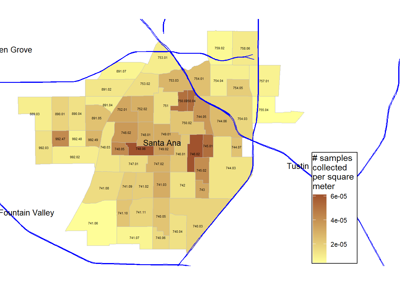
# Save plot (commented until I make changes to save)
#ggsave('figures/gg_masri_number_samples_per_m_sq.png', dpi=400, units='in')
Example interactive plots
Still in development! Here is an example of an interactive plot, which could be cool to layer with the Pb data.
mapview(OC_tracts)#leaflet(OC_tracts) %>%
# addTiles() %>%
# addPolygons(popup = ~NAME)Resources and More Information
This was ran in RStudio and documented on a Quarto (.qmd) file. Quarto enables you to weave together content and executable code into a finished document. To learn more about Quarto see https://quarto.org.
Version information:
RStudio 2024.04.2+764 “Chocolate Cosmos” Release (e4392fc9ddc21961fd1d0efd47484b43f07a4177, 2024-06-05) for windows Mozilla/5.0 (Windows NT 10.0; Win64; x64) AppleWebKit/537.36 (KHTML, like Gecko) RStudio/2024.04.2+764 Chrome/120.0.6099.291 Electron/28.3.1 Safari/537.36, Quarto 1.4.555
Really helpful explanations, tutorials, walk-throughs, etc. that I used to write this:
- Coordinate Reference Systems in Spatial Data with R
- Analyzing US Census Data Chapter 5: Census geographic data and applications in R
- Making a Better Map with Tigris
Further Reading and References
- Barba, L. A. (2018). Terminologies for reproducible research. arXiv preprint arXiv:1802.03311. https://arxiv.org/abs/1802.03311
- Masri, S., LeBrón, A., Logue, M., Valencia, E., Ruiz, A., Reyes, A., Lawrence, J.M., & Wu, J. (2020). Social and spatial distribution of soil lead concentrations in the City of Santa Ana, California: Implications for health inequities. Science of the Total Environment,743, 140764. https://doi.org/10.1016/j.scitotenv.2020.140764
- National Academies of Sciences, Policy, Global Affairs, Board on Research Data, Information, Division on Engineering, … & Replicability in Science. (2019). Reproducibility and Replicability in Science. National Academies Press. https://www.ncbi.nlm.nih.gov/books/NBK547546/